Educators Praise Let Grow
Schools are Recognizing the power of independence.
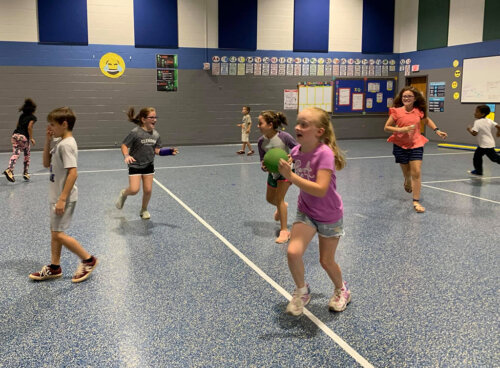
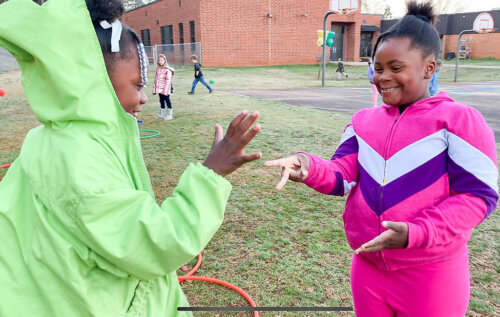
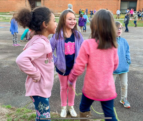
Many kids don’t get the social interaction they need to develop into empowered adults. Play Club is an intentional way for us to provide that for our students.

Elementary School Teacher, Central, South Carolina
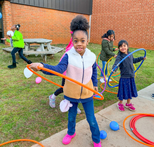
Let Grow is a perfect fit for all children, allowing every child and every family in our community to grow and develop into the very best version of themselves.

Dr. Aurelia Henriquez, Superintendent, New York
After my students participated in Let Grow’s initiatives, I saw a dramatic increase in their confidence level — and a dramatic decrease in their anxiety.